eCommerce
Zara Home
We've reimagined Zara Home by infusing the established e-commerce platform with an aesthetic flair, showcasing a blend of elegance and warmth to enhance user experience.

with Cozy Aesthetics
With this concept, we want to share our vision of what an interaction with the most cozy and warm brand can look like.
We like the current experience, which is suitable for e-commerce sales, but we wanted to show it with a more aesthetic approach.
In the process of redesigning Zara Home, we faced the challenge of maintaining the brand's renowned elegance while introducing a more inviting, cozy aesthetic. Balancing functionality with aesthetic appeal in an e-commerce setting required careful consideration of user experience and interface design.
Our goal was to create a seamless, engaging online shopping experience that stayed true to the brand's identity yet offered a fresh, warm perspective.
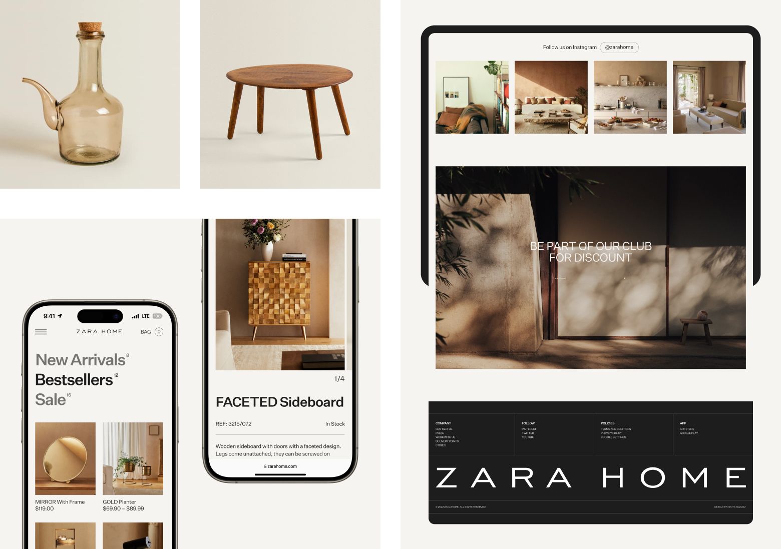
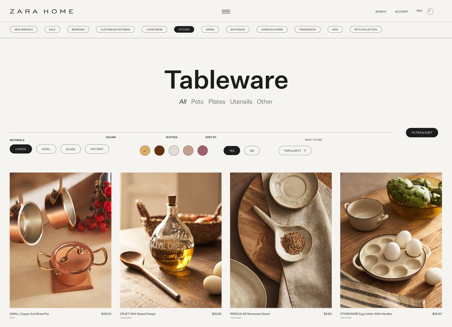
To effectively redesign the Zara Home website, we retained the familiar e-commerce user experience for ease of browsing and purchasing, while reimagining key aspects like filters, sorting, and the overall catalog aesthetics. The product pages were made more cohesive, ensuring that customers have immediate access to all essential details like price, photos, descriptions, dimensions, and materials.
Additionally, we revamped the "stories" section, drawing inspiration from mid-century modern furniture and tableware catalogs. This approach allowed us to create a stylistically distinct and appealing segment that not only showcases Zara Home's product lines but also tells a compelling visual story about each collection.

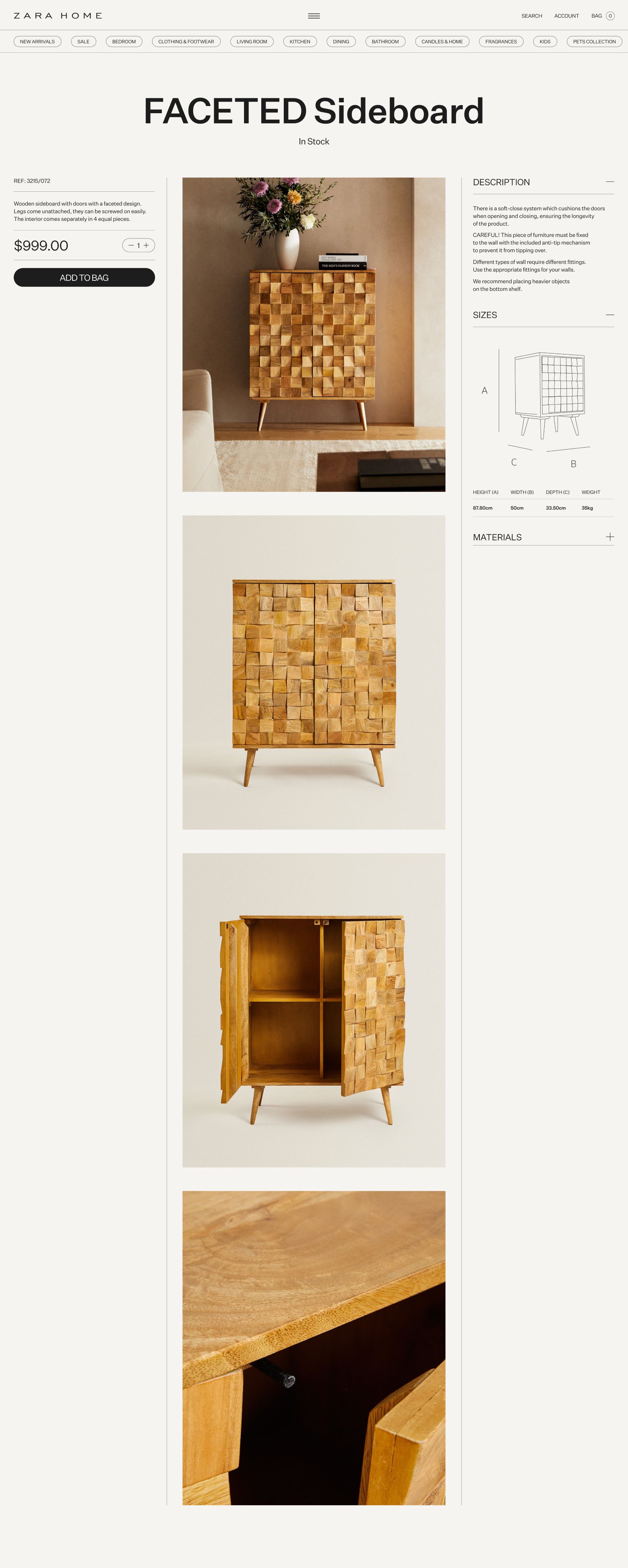
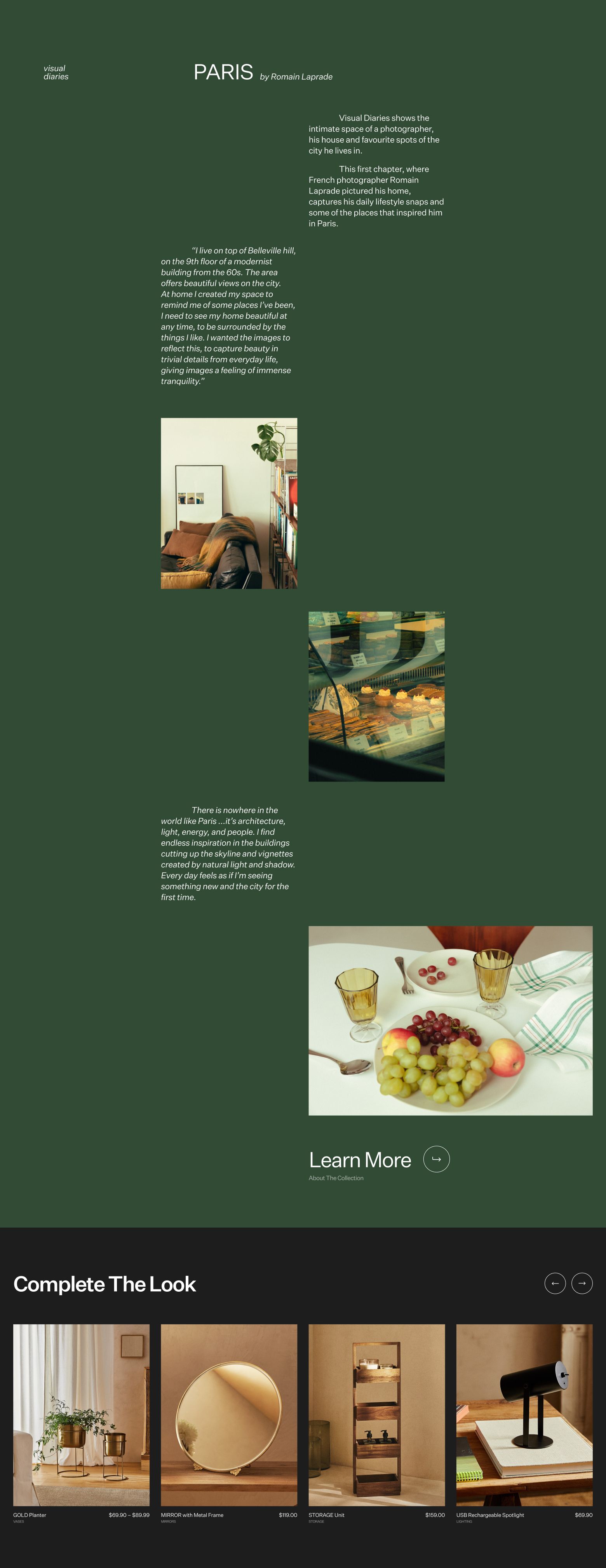
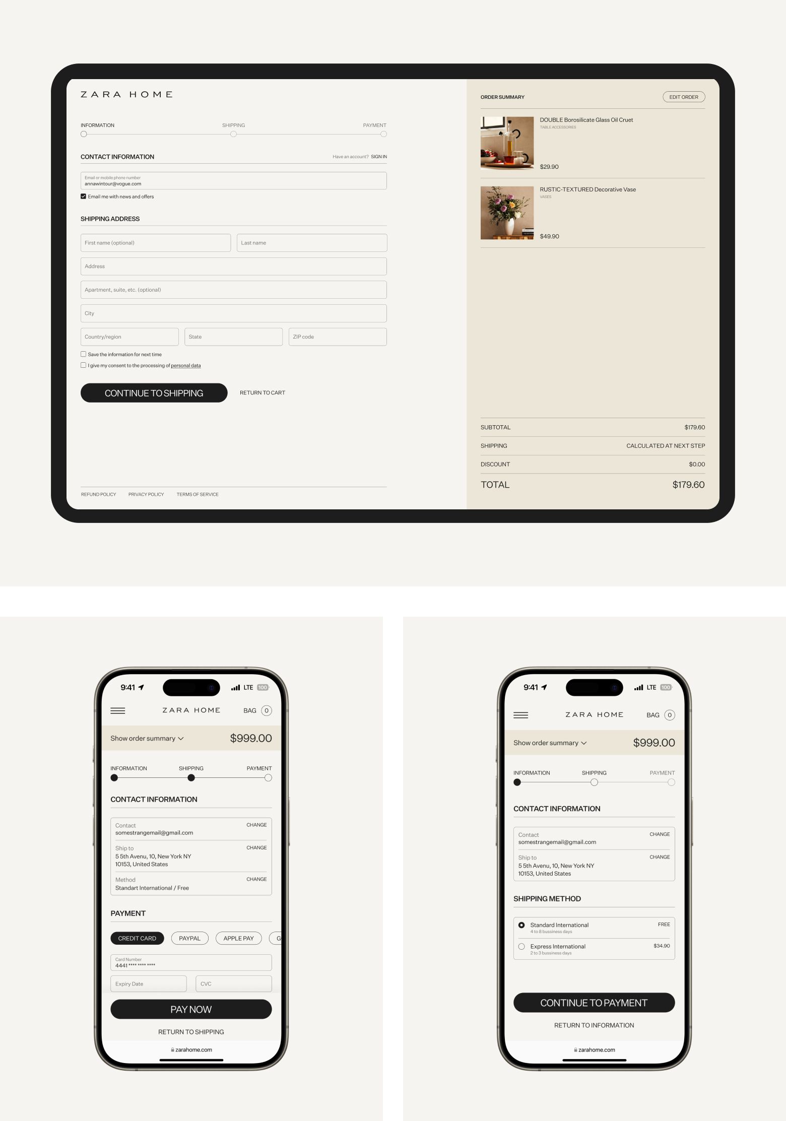
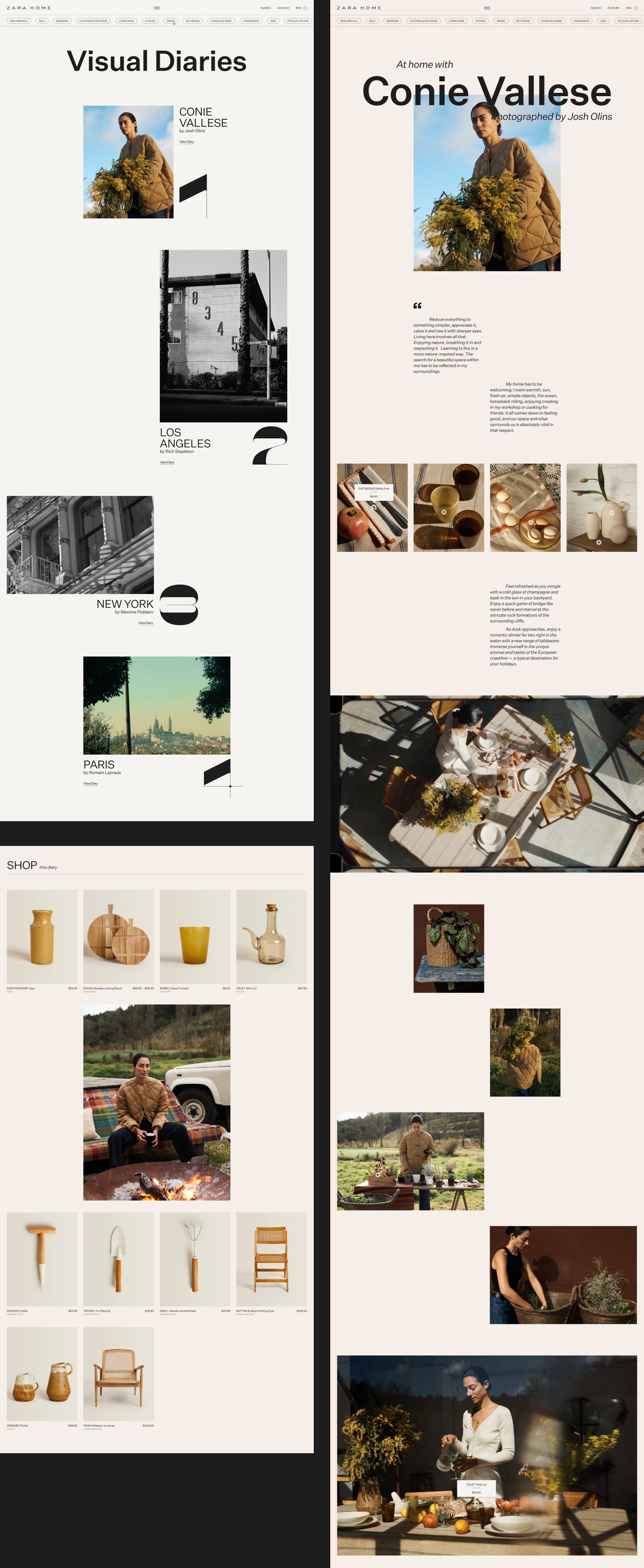
The Zara Home redesign seamlessly blends usability with modern style, offering enhanced product pages and a distinct, mid-century inspired "stories" section for an immersive shopping experience.
