Corporate website
Project 22
Website for Ukrainian Salesforce customization service provider that works across many industries, focusing more on retail, wholesale and non-profit.

Project 22 is an emerging Ukrainian service provider specializing in Salesforce CRM customization. Catering primarily to retail, wholesale, and non-profit sectors, they stand out in their field by prioritizing rapid setup and implementation of Salesforce solutions. Their unique approach includes a simplified onboarding system and flexible payment options, tailored to meet the diverse needs of their clients.
Digital Approach
We were approached by a new company specializing in Salesforce CRM customization seeking assistance in digitizing their operations. Their key objective is to expedite the setup and implementation of Salesforce CRM solutions by offering a simplified onboarding system and flexible payment options.
We noticed that competitors often use convoluted language and incomprehensible diagrams that don't clearly explain their services. Therefore, we focused on simplifying all available information and creating a clear narrative. We demonstrated how Project22 operates using straightforward tools like charts, diagrams, bullet points, and other narrative aids to clearly present the implementation process and the costs associated with Salesforce customization.

Approach
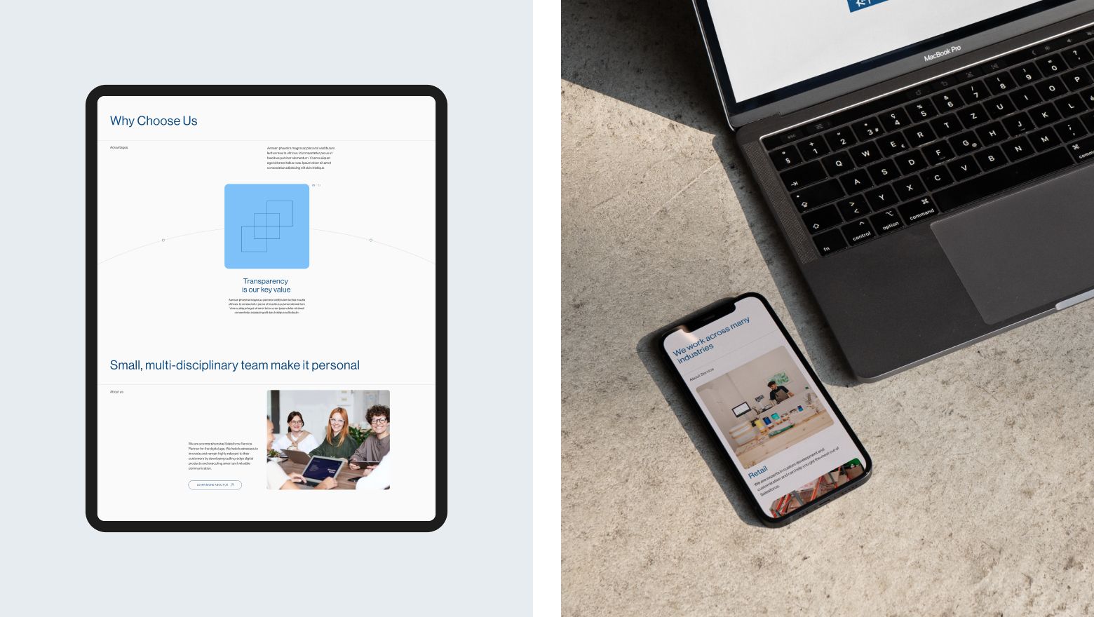
After analyzing the market, we discovered that most websites in this industry are visually outdated and lack clear information about the companies' operations and values. In choosing a visual style for Project 22, we aimed for an engaging presentation.
We utilized rounded shapes for a friendlier atmosphere and added animated graphs and charts to demonstrate Project 22's value. To enhance user engagement, we incorporated various micro-interactions, ensuring the site remains interactive and enjoyable.

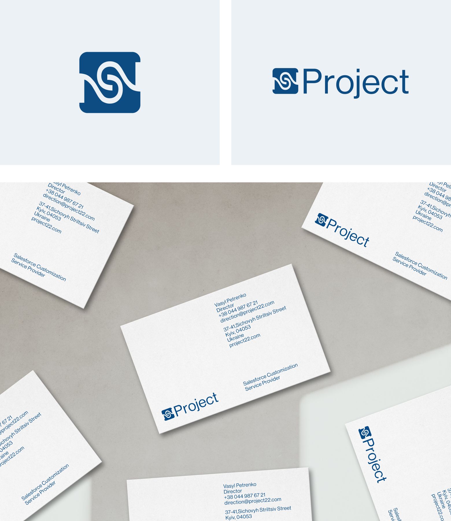
The company's name emerged during a phone call with a client, reflecting the experimental spirit of the project amidst the challenges of 2022. For the logo, we creatively merged two '2's into a symbol resembling infinity, representing client’s endless commitment to customer satisfaction. This design proved to be versatile and appealing, working well both digitally and in print.
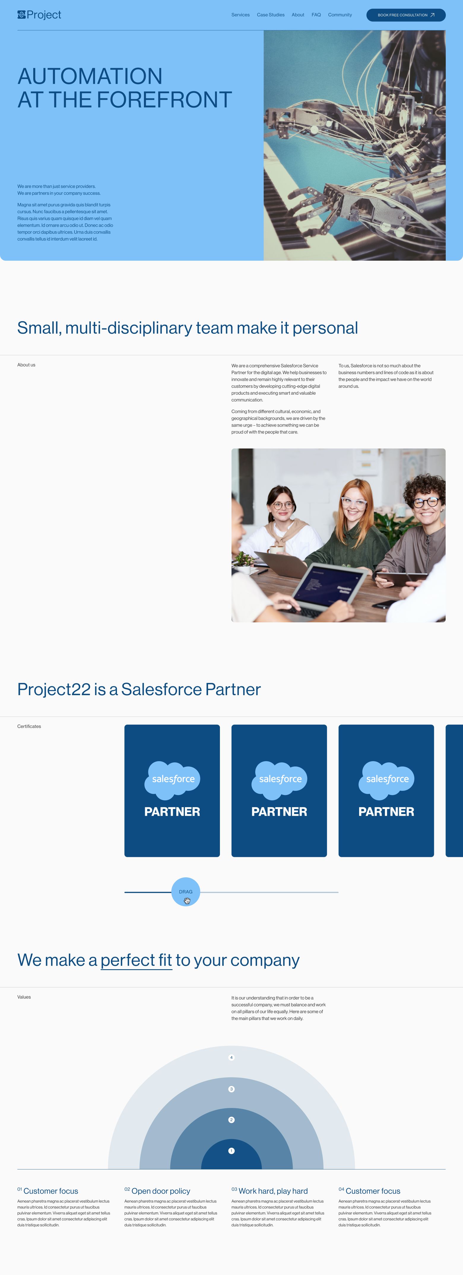
In the end, we've created an incredibly well-thought-out site that enables users to easily find necessary information and confidently choose our client's services.
