Corporate website
EBSSA International
Redesign for European Bodyguard & Security Service Association, where we transformed the website into a user-friendly platform, significantly boosting course enrollment and efficiency for the tactical training provider.

EBSSA's original website, which we developed during the early days of Totonis, had become outdated and failed to reflect the company's significant growth. To reflect its growth and global expansion, including three international training camps.
Our redesign focused on enhancing user functionality with streamlined course viewing and purchasing, and efficient verification of documents and instructor credentials. This transformation aimed to align the website's functionality and design with EBSSA's current global stature.
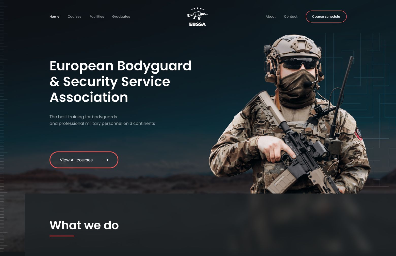
We faced a nuanced task with EBSSA's audience, who may not be as familiar with navigating complex online platforms. Our goal was to develop a user experience that was accessible and straightforward, ensuring that users could easily find and understand training information, and comfortably navigate the course purchasing process. This required careful consideration to create an intuitive and accommodating online environment.
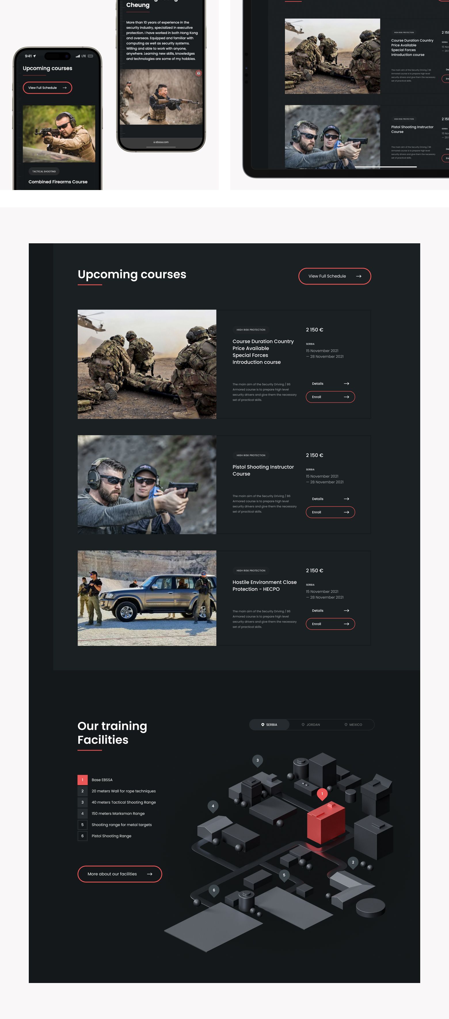
Our approach began with thorough research and direct conversations with the target audience to understand their specific challenges and pain points.
Armed with this insight, we embarked on a comprehensive redesign of the existing website. This involved enhancing the information architecture for better clarity and creating a visually simple interface tailored to user ease.
Key functionalities were integrated, including streamlined course registration and payment processes, and a system for verifying documents and qualifications of graduates. This verification feature especially became invaluable, offering potential employers a swift and reliable method to confirm the credentials of EBSSA-trained candidates.
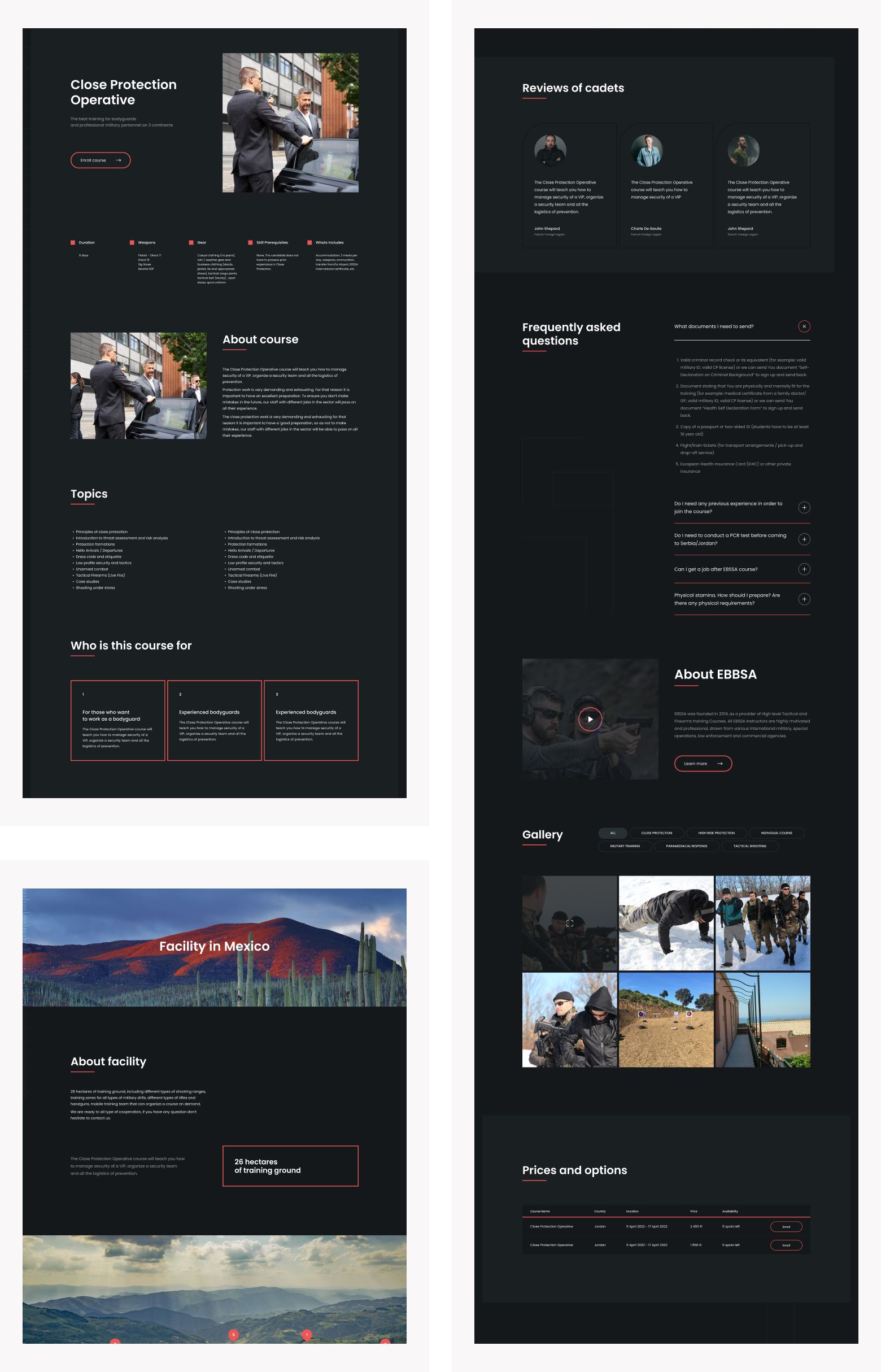
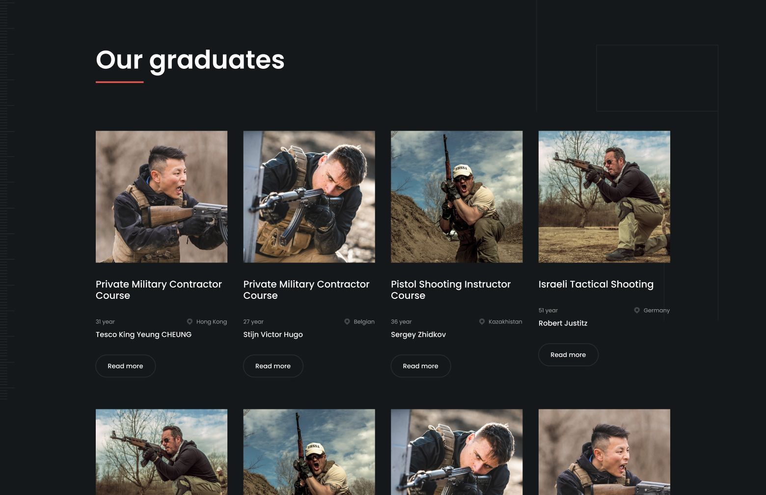
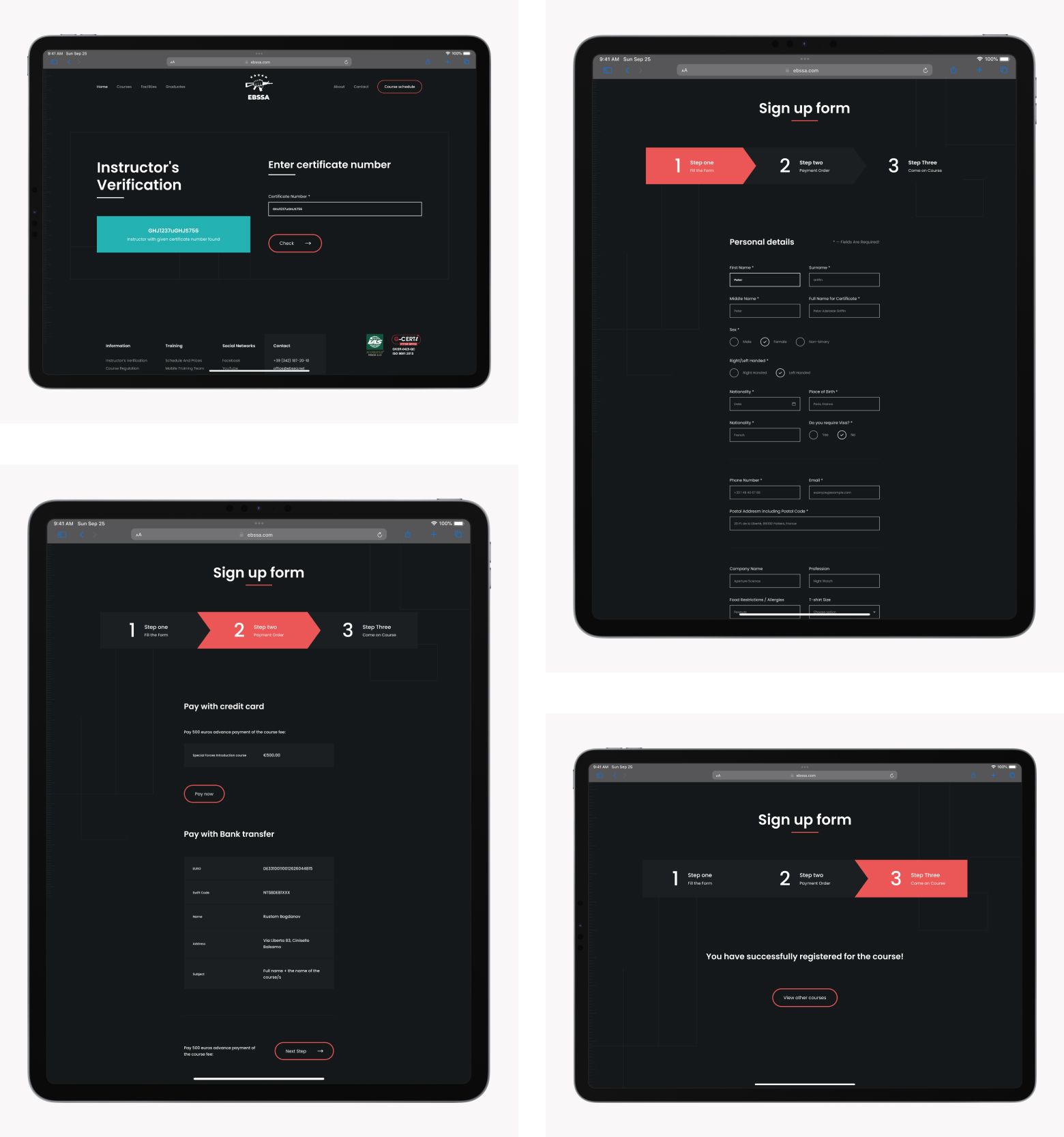
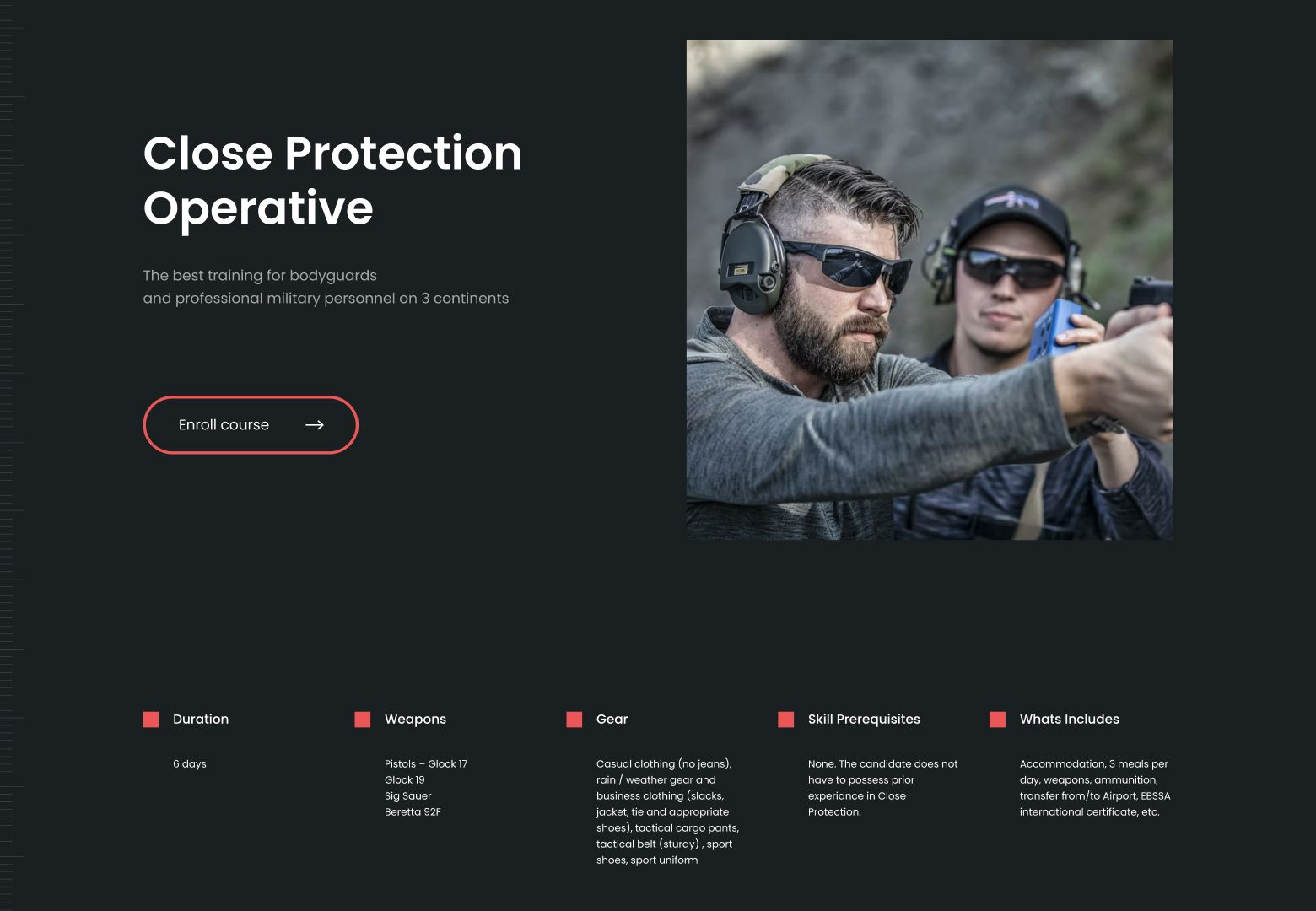
Our dedicated efforts have culminated in a modern, user-friendly website for EBSSA, streamlining the course discovery and enrollment process. The redesigned site features an efficient registration system, significantly reducing wait times for students and enhancing the company's operational efficiency.
Since the website's launch, EBSSA has experienced a notable uptick in student enrollment, reflecting the site's positive impact. We take pride in playing a pivotal role in our client's success and remain committed to ongoing improvements, adapting to their evolving requirements.
